Have you ever sat through an event presentation that felt like it went on for an eternity? We’ve all experienced it: That PowerPoint deck that had too many slides, too many bullet points, and waaay too many words.
Or, even worse, sat through a presentation in which a series of speakers each had their own decks, making the presentation feel disorganized, disjointed, and just plain sloppy?
Chances are, no one curated the decks in advance to put together one cohesive master PowerPoint deck with a lot more flair.
Fatal mistake if you plan on keeping your audience engaged.
What is a PowerPoint Slide Deck?
A PowerPoint deck is the collection of slides that compose a presentation. Think of a deck of cards. Each slide is a single card that makes up the deck.
A PowerPoint slide deck can vary in size and style depending on the purpose of the presentation and the information it carries, but that’s the beauty of it. You can craft the event presentation however you’d like!
Having a cohesive slide deck isn’t just for aesthetics. Your presentation will come across as more refined and professional when it’s composed in a single, uniform style. This is especially important if you have multiple presenters who are going to cover different topics, but are still working under the umbrella of the same brand. Each of their decks should be combined into one “master deck.”
This won’t only elevate the event experience, but your authority and reputation as well!
How to Build a Slide Deck in PowerPoint
Mastering the PowerPoint deck can be done one of two ways:
1. PowerPoint Deck Templates
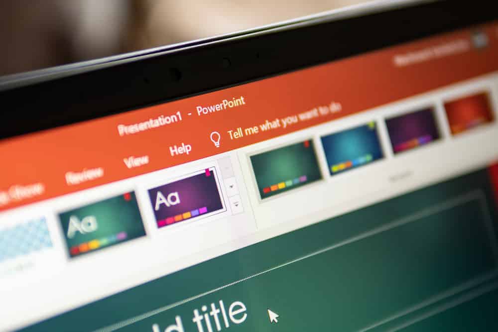
PowerPoint comes with a diverse catalog of presentation templates that you can update and customize however you’d like. You can insert and edit the text directly in the template or experiment with fonts, colors, and graphics.
Each pre-made PowerPoint deck comes with different slide types that vary in composition. They’re designed to meet as many different needs as possible, from corporate charts to fun product presentations.
If none of PowerPoint’s built-in templates tickle your fancy, try searching online for a downloadable template that meets your needs.
2. Building a Slide Deck in Slide Master
If you want a bit more control over your event presentation, you can try your hand at creating an event deck of your own.
Make your way to the “Slide Master” setting in the “Views” tab. The slide master allows you to customize font type, colors, backgrounds, animations, and more to the slide deck. The changes made on the slide master will be reflected on subsequent slides, creating a unified theme for your entire presentation.
Take the time to experiment to find a PowerPoint deck style that will help communicate the information you’re presenting and engage your audience. You can also draw inspiration from great PowerPoint deck examples that you’ve seen yourself or online.
Tips for Creating Great Slide Decks
Less is More
Ever heard of white space? It’s the open spacing around text and images and it’s incredibly important to your audience’s experience. White space provides visual breaks for your viewers’ eyes. You also have to keep in mind how the presentation is being projected.
This is why keeping the amount of content on a slide to a minimum is critical. Break up the amount of information you provide across your presentation rather than trying to stuff it onto only a handful of slides.
Your audience will also have an easier time digesting what you present to them this way.
Write the Content First
Make sure that you know what you’re going to try and communicate before you start preparing your slide deck. If you start out crafting the style of the deck first, you might find that it doesn’t match the feel or, even worse, size of the copy you’ll put in after. This can lead to having to backtrack and make changes.
You can avoid all of those redos by writing your content first and then stylizing it afterward.
Structure Your Slide Deck Ahead of Time
Audiences can tell when you just slapped something together by how organized your presentation is, and, trust us, they don’t appreciate it if they think you’re wasting their time.
Have your event planner collect and compile any individual presentations, integrating them into the master deck.
Be aware of how long you have to present and your PowerPoint deck size. A good rule of thumb is to allow two minutes per slide.
Keep all of your engaging, meaningful content toward the front of the deck. If you wait until the end, you can run out of time or lose your audience’s interest.
Stay Consistent
Consistency is key to most things in life, and your PowerPoint deck is no exception. If your company has a particular brand style guide, make sure you stick to it through the entire deck. If you’re a free agent, it’s still important to the visual experience for your deck to feel like it’s one, single presentation. This means using the same fonts, colors, imagery, and formatting across the presentation.
PowerPoint has been the king of slides since 1987, but no matter what event presentation software you use, One Way Event Productions can help your event go off without a hitch. Creating a master PowerPoint deck can be complex and time-consuming. We have professionals at the ready to take all of your presenters’ slides and unite them into one uniform deck. It’s just one of the many services we offer when you bring us on board as your event production specialists. If you’re looking for experts to take your event—and your presentation—to the next level, contact us.


