


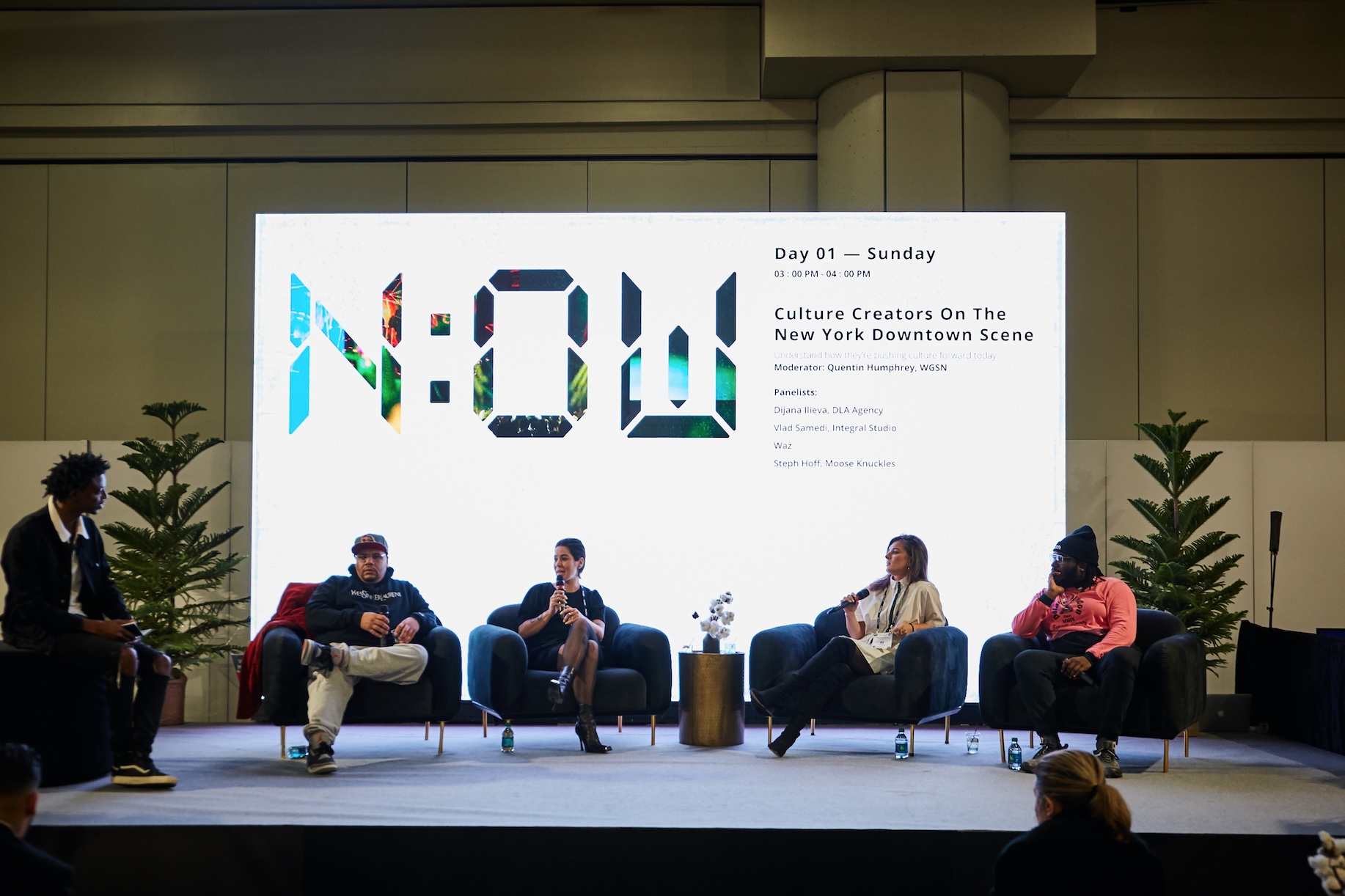
It’s very rare these days that presenters in large-scale events deliver their speeches without using any visual aids. In fact, the vast majority of presenters utilize PowerPoint (also referred to as PPT) or similar presentation software, like Keynote or ProPresenter. (However, PowerPoint is the most overwhelmingly popular and common platform used, so for the sake of this blog, we’ll just say PowerPoint.)
PowerPoints are useful tools because they make presentations more visually dynamic, give speakers something to interact with or refer to, highlight important concepts and figures, and utilize images or other visuals that help to illustrate their points.
However, when a PowerPoint is designed incorrectly, it can quickly go from a visual aid to a big distraction.
Keep reading to learn how you can make sure your event utilizes effective PowerPoint presentations.
Prioritize Readability.
Whether it’s a difficult to read font, text that is too small, or simply too much copy on a slide, the biggest way a PowerPoint becomes a distraction is when the audience struggles to read it.
While some attendees won’t bother trying to decipher the text and instead listen to the presenter, others will find themselves leaning forward in their chairs, squinting, or even asking other people what the slides say. They may not even realize that they’re missing the most important thing onstage: the presenter themself.
By ensuring that your PowerPoint slides are easy to read from anywhere in the room (don’t forget the people seated in the back or far to either side!) you’re avoiding one of the biggest pitfalls there is.
Keep Content on Slides Minimal. 

Repeat after me: a PowerPoint presentation is not a notes deck.
Readability isn’t the only reason you should keep content on slides minimal. Presenters should never treat a PowerPoint as a notes deck and they absolutely should avoid sharing every detail they plan to say during their presentations through visuals.
When they do, people wind up reading instead of listening – making them less connected with the actual presenter.
Stay Consistent with the Brand and Event Theme.
Many large organizations create PowerPoint templates that are shared with all presenters (or the people making the presentations for them). These templates can usually be easily populated without altering the design.
If you’re a presenter (or working with a presenter) and you’re lucky enough to receive one of these… use it.
Unless the event’s graphic designer is creating a custom presentation for you, a template is an easy way to make sure you’re utilizing the right fonts and colors for the organization, as well as featuring logos or lock-ups specific to the event. You don’t have to worry about misusing design elements or putting the wrong font in the wrong place – it’s all done for you.
It also keeps all of the PowerPoints, across every presenter and session, consistent.
If a template isn’t provided, check to see if the organization has brand guidelines that outline colors, fonts, or presentation tips. Just like in high school when a teacher provided the class with a study guide that essentially told them exactly what would be on the test, brand guidelines are a cheat sheet that help you understand, and work within, the organization’s brand.
Use High-Quality Images.
Picture this:
Your event has a beautiful, large LED wall that spans the entirety of the stage. The text in your presentation is crisp and clear. The company logos are sharp. The colors pop.
And you copied and pasted an image directly off Google. A little digging would’ve told you that the resolution is 300×480. And on a screen that big, it shows.
At best, the image is slightly pixelated. At worst, it’s so blurry that people can barely tell what it is. Instead of being a great addition to your presentation, it’s a new distraction and lacks professionalism.
If you’re not sure if an image will look good onstage, ask your AV team. They’ll be able to recommend a minimum resolution or pixel count and help you understand what visuals will capture your audience’s attention in the right way.


Use Motion or Builds on Your Slides.
To be clear, nobody is suggesting the classic swiping or spinning transitions that 90’s kids spent hours applying between every slide of their school presentations.
When we refer to motion or builds, we mean within the slides. Whether different information builds with each click so that presenters can reveal images, text, or numbers as they speak, graphics that build, or charts that animate rather than popping onto the screen, using motion within the slides makes the presentation more dynamic.

The right presentation does more than make the presenter look good – it makes them feel confident and keeps attendees engaged throughout the session.